
HSL Lightroom panel
I used to watch movies and wonder how do they do that. That. That right there with the beautiful greens and blues. I would take a sip of water — or a bite of popcorn if we were at the movie theatre — and tell myself that the team behind the movie just had a ton more tools than I did. I give you, the HSL Lightroom panel.
HSL is part of how you can color grade in Lightroom.
Color grading happens after you've handled the basics of your editing: temperature, tint, exposure, contrast and the rest.
Let's dive into the HSL panel in Lightroom and figure out what kind of color you're inspired by.

HSL Lightroom panel — what it means and how to use it
What does HSL stand for?
H - Hue
S - Saturation
L - Luminance
The hue slider shifts one color to the next color. For example, you could work with the blue hue slider to effect the ocean's color in your recent travel photo.
The saturation slider shifts the vibrancy in a particular color. If you shot a photo during an indoor ceremony, you might need to decrease the orange saturation. Or you could just apply the overhead light preset from the BPS — it handles icky color like a boss.
The Luminance slider works with the brightness of a specific color. You could use this slider to brighten or darken the sky in your image.
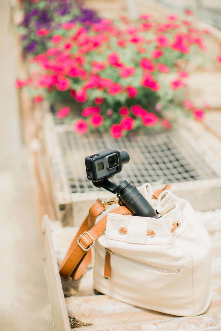
Ready to see a behind the scenes image?
One of my 2018 goals is to take more time to be creative! So one day I grabbed my camera and a venti water from Starbucks because #hydration.
Just picture me trying to juggle a camera, purse and drink and you'll have the right image in your head. Ha!
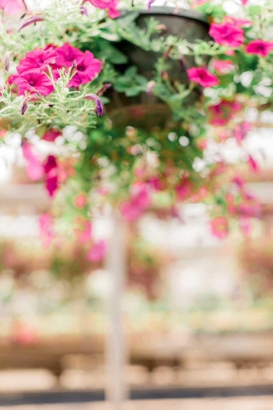
If you walk in from the front of the greenhouse, this is what you'll see...
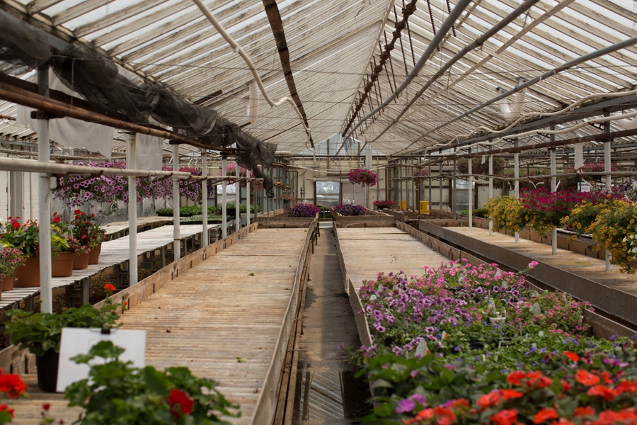
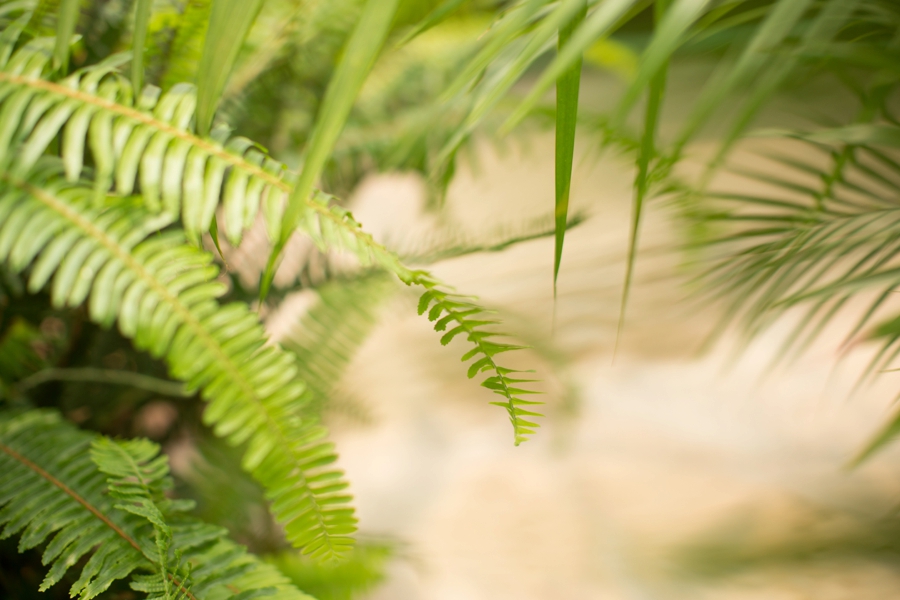
Greenhouses are a great place to start learning how to shoot in manual, but just because you are working with evenly diffused light doesn't mean you automatically get a light and airy image. I wanted to show you the image above so that you could see what I was working with: the greenhouse isn't full of flowers this time of year and in a lot of ways, it isn't an illuminated space.
Unless you know where to look.
One walk around the greenhouse and I landed on the spot in the back by the door. If you just walk down the path in the middle of the above photo, stand in front of the door and turn around, you'll see the hanging flower basket below...
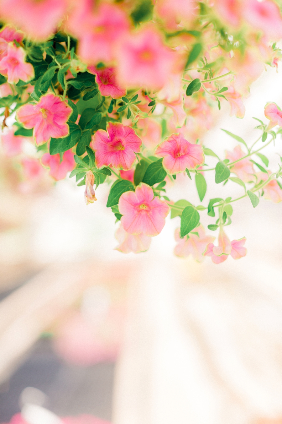
Edited with the light and airy Brittley Preset Suite
Step one: Open the develop module
Once you've got Lightroom open, select "develop" in the menu to open the develop module. Scroll down and expand the HSL panel. This is what you'll see...

Step two: display "all"
When you first expand the HSL panel, you'll see that Hue, Saturation, and Luminance are all split up. I've found that it's easier to just click "All" on the right side of this panel so I can see all of the colors and get an overall picture of what's happening with the adjustments.
When you click "all" here's what you'll see...

Step three: adjust the sliders
Adjust the sliders until you find a look you love! Now, I know that this part can feel a little overwhelming because there are so many possibilities. After you play around for a bit, you'll see that a lot of the possibilities aren't the best fit for a natural edit, so here's what I'd suggest as a starting place.
Saturation: Decrease the saturation for orange, yellow and green. No matter what camera you're using, decreasing these saturation values always looks good!
Luminance: Only make small adjustments in this area until you get a good feel for exactly how it's effecting your image. Every adjustment effects that specific color and that color's compliment color on the color wheel.
Woah, woah, Jordan.
I know, but before you go overboard in this panel, you'll want to get acquainted with the color wheel or you'll end up with greens that look too minty or overly muted.
My philosophy of a good edit isn't eliminating all color and getting a muted, washed-out image. You can totally do that, but here's what I've learned from my years of coaching other photographers...
Most photographers who are editing for a super washed out, muted color palette would actually love a little more color. They just don't know how to get good, clean color...
They end up dragging the saturation out of all of the colors and end up with a barely saturated image even though they want more color.
Believe me, I get it! Editing the right color for your clients or your own brand is a big deal.
If you want to simplify this process, I handle this panel (and every other panel) in the BPS and I make sure every detail is handled.
Light & Airy Photo Recipe
Edited with the mix and match presets from the Brittley Preset Suite
1: Light & Airy Pro
2: Recover Whites
4: Medium Contrast
6: Warm Skin Tones
7: Green Saturation
8: Portra Film Finish
9: Low Grain
After this edit, my image was still looking a little yellow. It wasn't an editing problem, it was a scenery problem. The concrete and wood in the photo definitely had a yellow tint (I'm guessing from natural wear and tear?) and it made the whole image feel yellow.
I opened the HSL panel and decreased the yellow saturation to -58. A good rule of thumb: if you bring the saturation slider down that much, you'll want to zoom in to make sure that there isn't any color clipping or harsh lines between that color and the surrounding colors.

Quick editing tip: open your favorite images
Open your color profile and keep it to the right of Lightroom while you're editing. Make it super easy to edit consistently in Lightroom.

Step 4: If you decrease one slider, you might have to decrease another
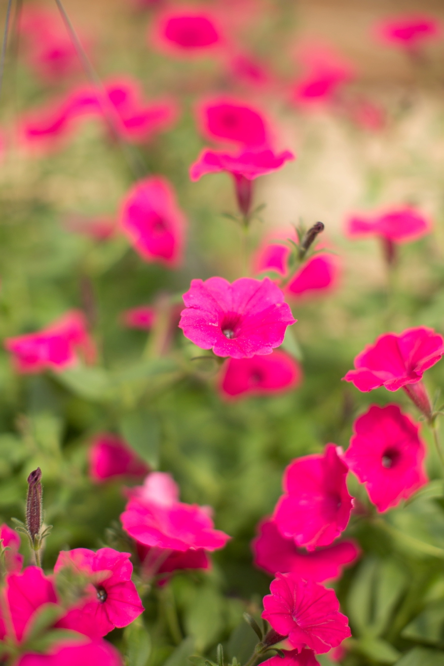
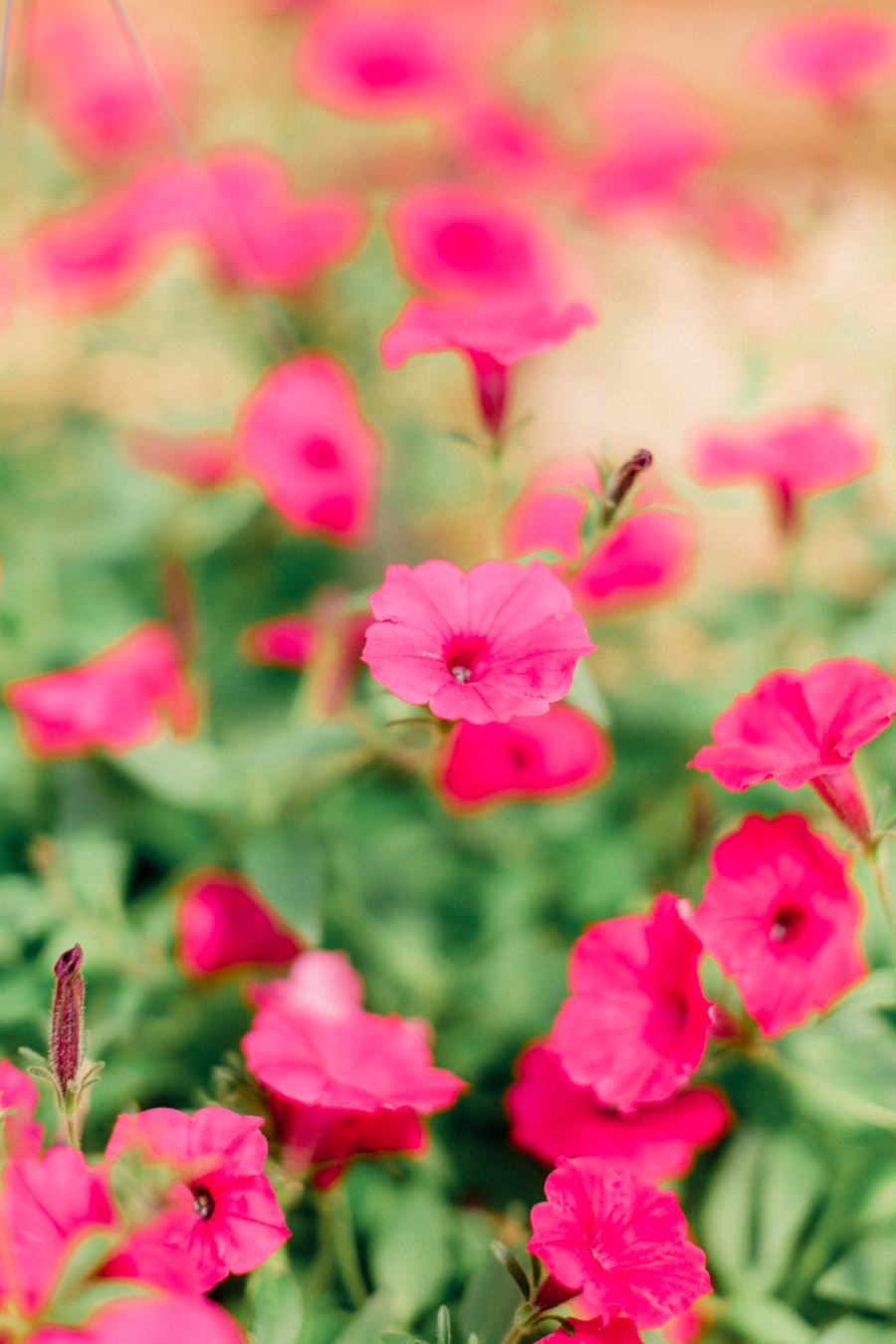
I did a quick 10 second edit on the image below and the flowers were really vibrant. Have you ever seen this happen to reds?
It's interesting because this wasn't an editing problem either. Green and blues can do the same thing, but you'll most often see this problem when you're dealing with reds! It can happen when you're shooting digital or film.
Here's what I did to fix the problem...

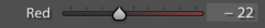
I opened the HSL panel and decreased the magenta saturation by quite a bit: -47

But then I noticed that there was some color clipping, so I brought the red saturation down as well: -22
What do I mean by color clipping? You'll see it when you zoom in and there's a pixelated line or separation of colors where there should be a smooth change.
And here's the before and after with those extra saturation adjustments!
The HSL panel is a great way to get started with color grading your images. Next time you watch a movie or host a Netflix marathon, take note of the kind of coloring you like. Psychologically we tend to like the warm skin tones, cool background look. So I'm curious to hear what you end up loving!
Do you use the HSL panel when you're editing?
Related Post: Double exposure tutorial (no photoshop required)

Love pinterest?