How to use the Light & Airy Fuji Modern Preset
Hey, hey! Curious about the Fuji Modern preset tucked away inside the Light & Airy Preset Suite? Got you covered, friend.
And psssst — can I put a bug in your ear? This Friday is my first day back to work! Maternity leave is wrapping up and I have never felt more excited or focused or inspired in this creative biz. Cannot say enough things about taking maternity leave and just carving out time to go "offline" in your creative business each year.
Back to this gem of a preset...

I designed these presets to make editing easy peasy for you, so you can absolutely just click a preset and be on your way. But if you want your photo work to look consistent across time and you're not shooting in the same studio at the same time of day with the same lighting conditions every time, you'll need to add a little adjustment here or there.
Every shooting situation is one-of-a-kind and that means you're probably not shooting in the same studio at the same time of day with the same lighting conditions every time. We are creative after all! And I've never met a creative who could do that day in and day out for 10+ years.
We love when things are different. We love to inspire others. And we are inspired by the change of seasons. We are inspired by different lighting conditions.
So because shooting adjustments are happening, editing adjustments will need to happen.
So here's what we are working with today...
How to use the Light & Airy Fuji Modern Preset
I flew out to Maine last year to speak at the MPPA convention and they asked me to put together a shoot to kick off the event.
We spent the day on the sides of cliffs — the ocean swelling just below — and I taught a workshop on how to approach a shoot like this. We're talking marketing strategies (like getting published), composition, lighting, posing, and even letting the design inspire your creative workflow.
I cannot say enough about Megan of Field Floral Design. I'll be sharing the whole shoot soon because we were just published on Elizabeth Anne Designs, but for now I wanted to give a break down of the shot above.
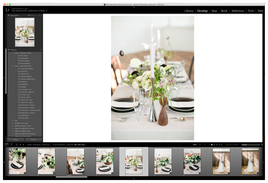
1. Load those images and apply the fuji modern preset
Once you've loaded all of the images from your shoot and organized them (go ahead and give them their own "RAW" folder), import them into Lightroom. Now sure how to get that Lightroom working? I have a whole tutorial right here.
Once your images are loaded and culled, go ahead and apply the Fuji Modern preset from the Light and Airy Preset Suite. Immediately, you'll go this... to this.
Drag the slider to see the before and after
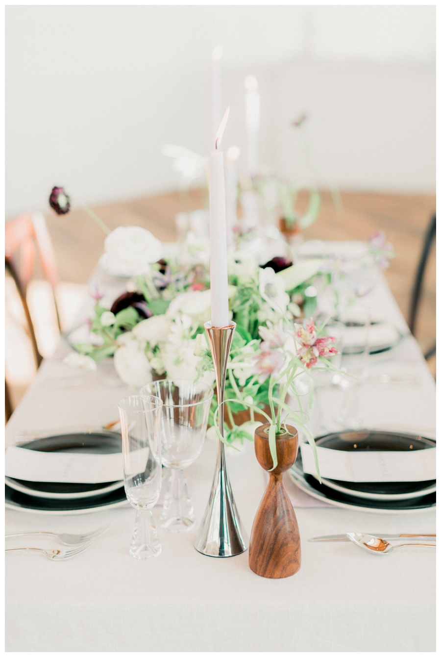

The Fuji Modern preset has a warmer undertone with a creamy, sharp finish. I created it for your beach shoots, your desert shoot, and anywhere you need to keep that muted palette without actually muting your image.
And that's exactly what I needed for this shoot. It wasn't necessarily monochromatic, but I needed the focus to be on the design work in the flowers, slightly vibrant, and warm. Who else loves warm wood tones (as long as they don't look burnt)?!

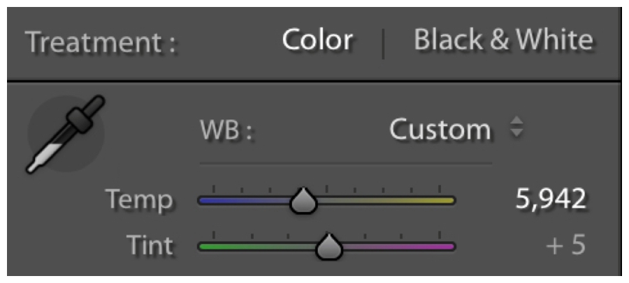
2. Tackle the white balance and adjust the temp & tint
After you've applied the preset, look at your white balance. I could just apply the preset and be on my way, but by warming it up, it brings out those design elements just a little bit more.
White balance is the easiest mistake to make when you're editing and it's the most common mistake I see. I don't say that to put the pressure on or make you feel insecure about your work, but more to encourage you because sometimes you look at an image and you think it's unusable or you messed something up when really just need a bit of temp & tint adjusting.
The Fuji Modern preset won't touch your temp & tint in case you're a rockstar and nailed it in camera.
I warmed my image up just a bit because of those wood tones I was talking about! I want West Elm to be proud, y'all.

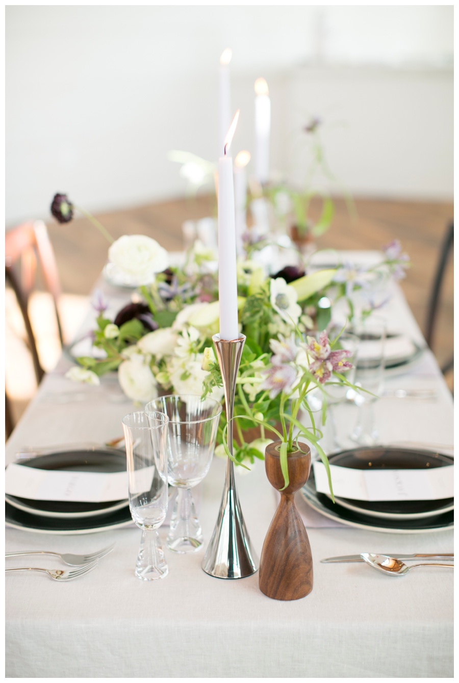
3. Add depth if your image is flat
I was shooting in a white room with a white table cloth and white candlesticks — I'm going to need to add some contrast.
... Or am I?
If your image feels icky and like all of the pieces are blending together, you might just need a little more contrast! But if you're just looking for a little more oomph while keeping that film look, then bring those blacks down instead!
Instead of bringing up the contrast, I decided to bring down the blacks. And it was the perfect combo!


4. Hit the "\" button over and over again
If you love Lightroom shortcuts, then you probably know about the before and after shortcut: \
No, I don't think it's a total waste of time to just stare at Lightroom and hit that button over and over again. It's also perfectly acceptable to plaster social media with before and afters! I mean... who doesn't want to see a work in progress?!
I'd love to see what you do with the Light and Airy Preset Suite! Let the presets do the heavy-lifting and share your work with the hashtag, #lightandairypresets

If you've already purchased the Light & Airy Preset Suite, you have access to the Fuji & Portra presets inside the member area.
If you can't find the email or access the membership site (Hellllllloooooo forgetting passwords! Happens to this girl right here all the time!), shoot our team an email, and we'll get you squared away: jordan [at] jordanbrittley [dot] com.

love pinterest?